Las Alamandas
Product
Website
Year
2023
Industry
Hospitality
Disciplines
- User research
- UX Strategy
- UX/UI Design
- WP development
Product
Website
Year
2023
Industry
Hospitality
Disciplines
- User research
- UX Strategy
- UX/UI Design
- WP development
About the Client
Las Alamandas is a luxury resort located on the coast of Jalisco, Mexico. Beyond its high exclusivity, serving as a private retreat for celebrities and high-net-worth individuals, it is characterized by offering a service tailored to the specific needs of its guests.
Requirement
Despite its tireless efforts to achieve the demonstrated satisfaction of its guests, Las Alamandas had a website that fell far below its own standards, to the point of not considering it as a sales tool, as customers made their reservations by phone, repeatedly complaining about the website.
The explicit request was “we want to break the negative image that our customers have of the site and also have them make their reservations from there.”
Development Process
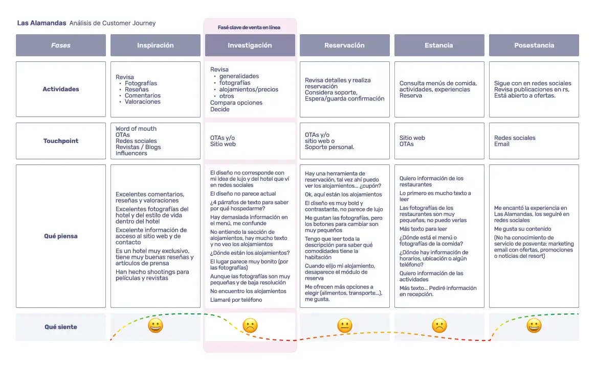
To gain a better understanding of the website’s role in a user’s accommodation selection process, I conducted a customer journey, identifying that it covers 3 stages: research (mobile), booking (desktop), and stay (mobile). For each of these stages, I broke down the actions and expectations that we should meet to achieve our objectives.
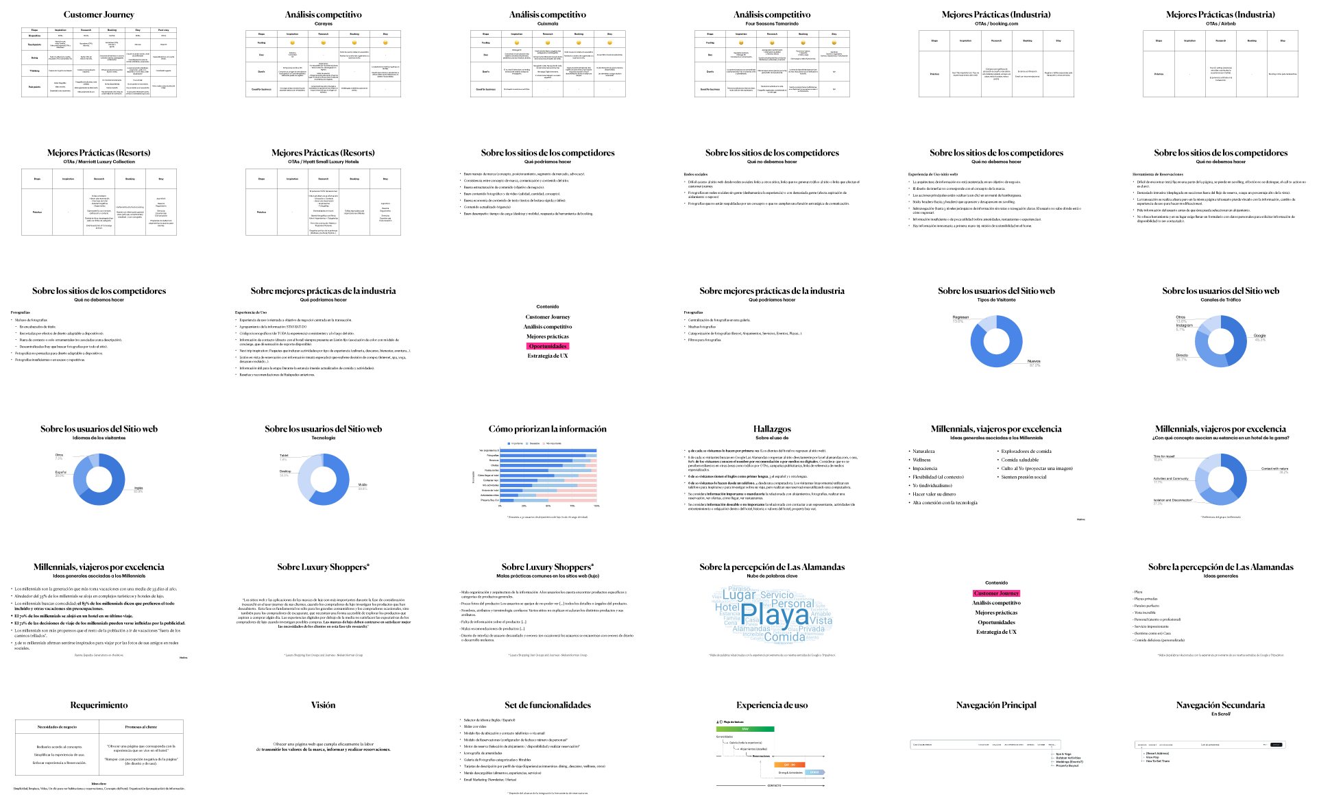
Subsequently, I conducted an analysis of direct competitors and best practices of OTAs, accommodation platforms, and hotel chains. Other research areas included: behavioral patterns of luxury shoppers, audience analysis, pain points, data on current site usage, word cloud analysis of perception in reviews, among others. All findings were delivered to the client in a 47-slide presentation.




Once all the information was structured, I proceeded with the UX strategy under the vision of “Offering a website that effectively fulfills the task of conveying the brand’s values, informing, and making reservations” and the following set of features and functionalities:
- Language selector (English/Spanish)
- Fixed module for location and contact by phone or email
- Booking engine (Accommodation selection/availability and make reservation)*
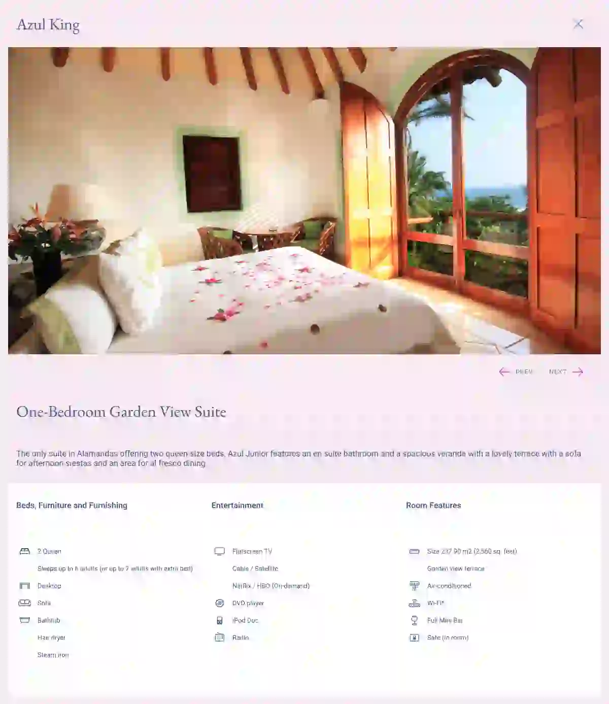
- Amenities iconography
- Categorized and filterable photo gallery
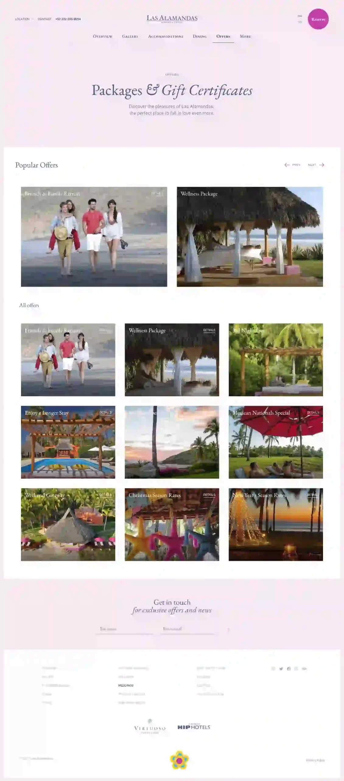
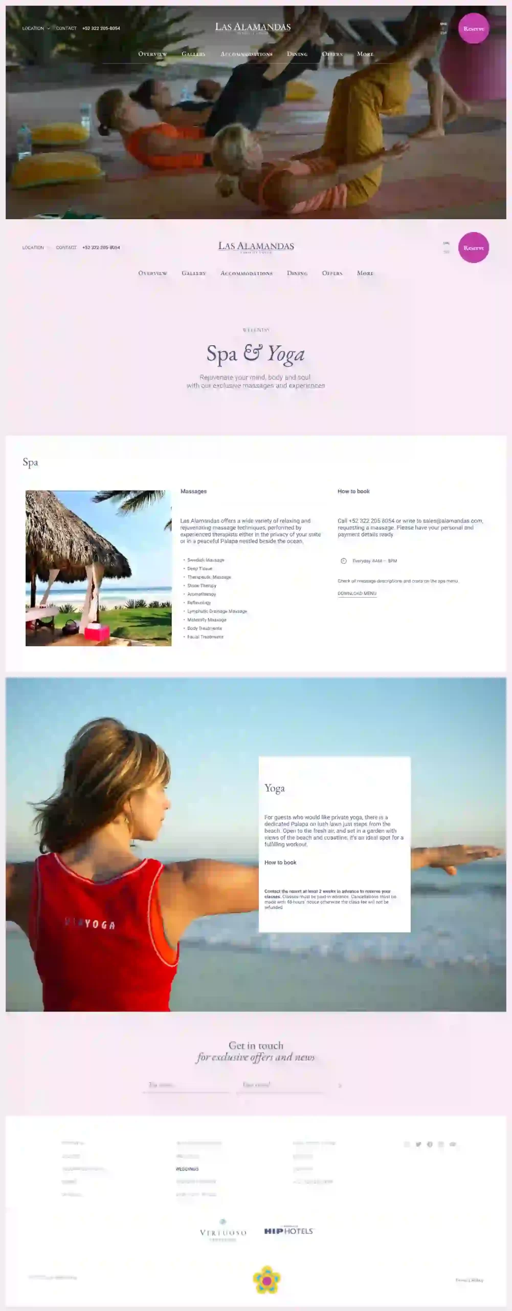
- Description cards by travel profile (Immersive experiences: dining, rest, wellness, others)
- Downloadable menus (food, experiences, services)
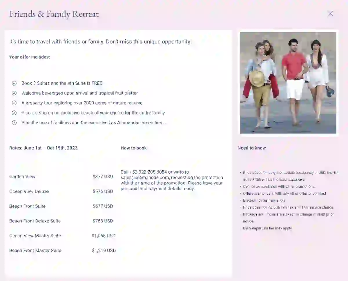
- Email Marketing (Newsletter, Offers)
An experience grounded in usage priorities.
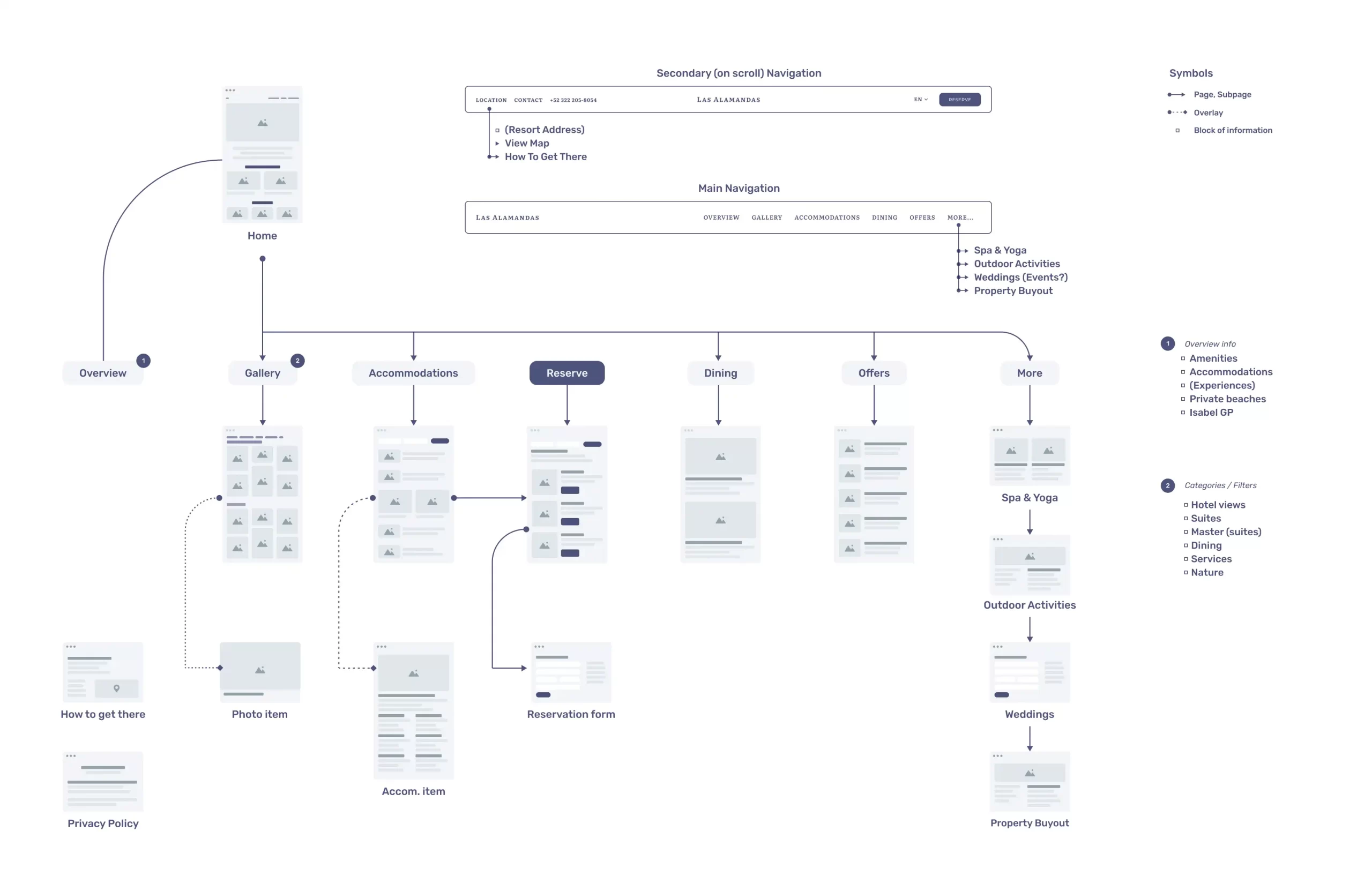

UX/UI Design
The site’s structure and design system were based on the following guidelines:
-
Prioritizing information:
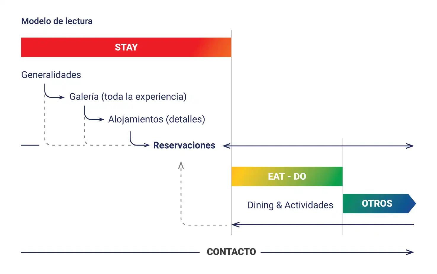
The reading flow should fulfill a communication objective, the site as a story that progressively answers the questions that we knew visitors would ask.
-
Correspondence between brand concept and user experience:
Complete harmony between the photographs (the resort) and the interface: the photographs take center stage, the interface frames them. Keywords: warmth, moderate contrast, fine lines, soft textures: the rest starts from the site.

