The brand and website needed a more current presence for Isla’s 10-year milestone and evolving positioning.
Strategy
Define a bold, grid-driven identity system and apply it across a redesigned website and social guidelines to keep executions consistent.
Impact
A cohesive relaunch package ready for the anniversary launch, validated through stakeholder reviews and delivery sign-off (no post-launch analytics available).
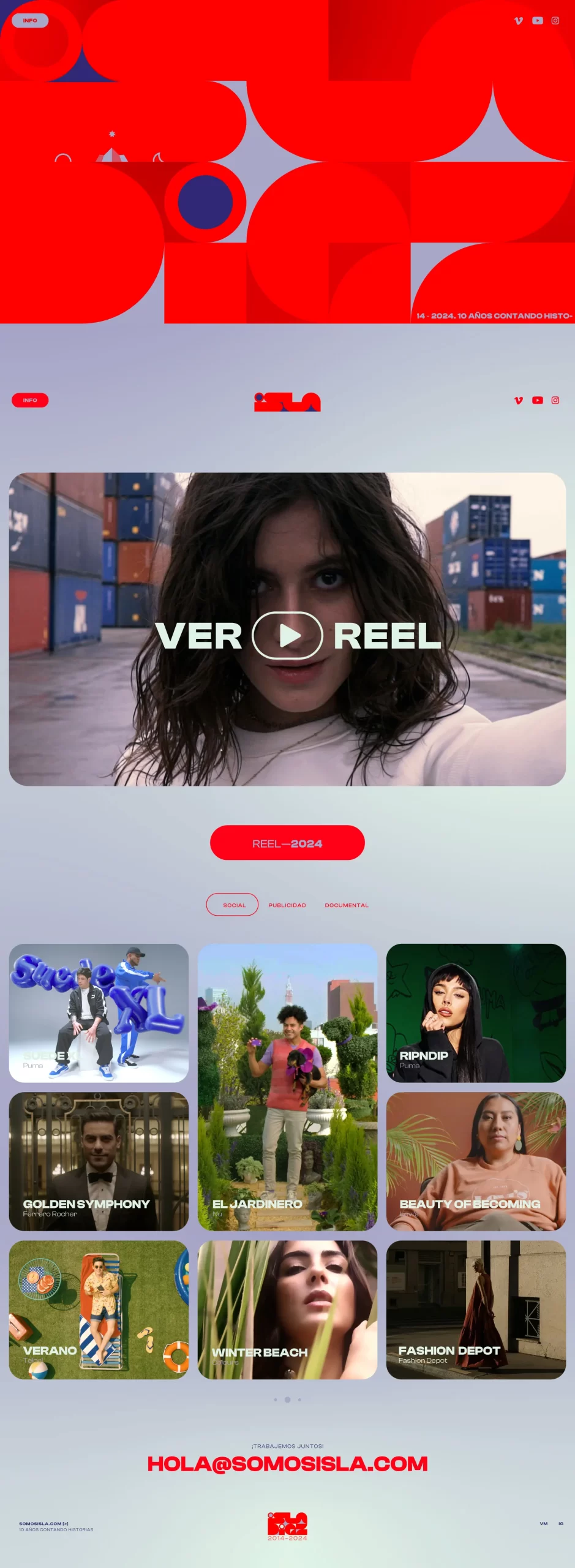
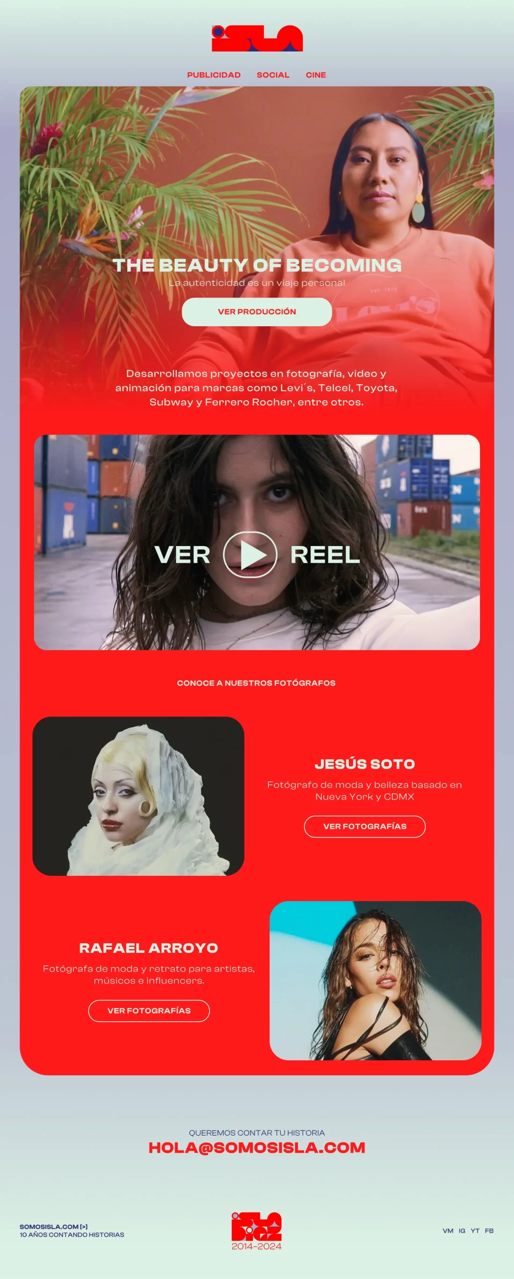
A reel-first homepage showcases productions with a bold identity language and high-contrast visual rhythm.
Design Decisions
Key Decision 1
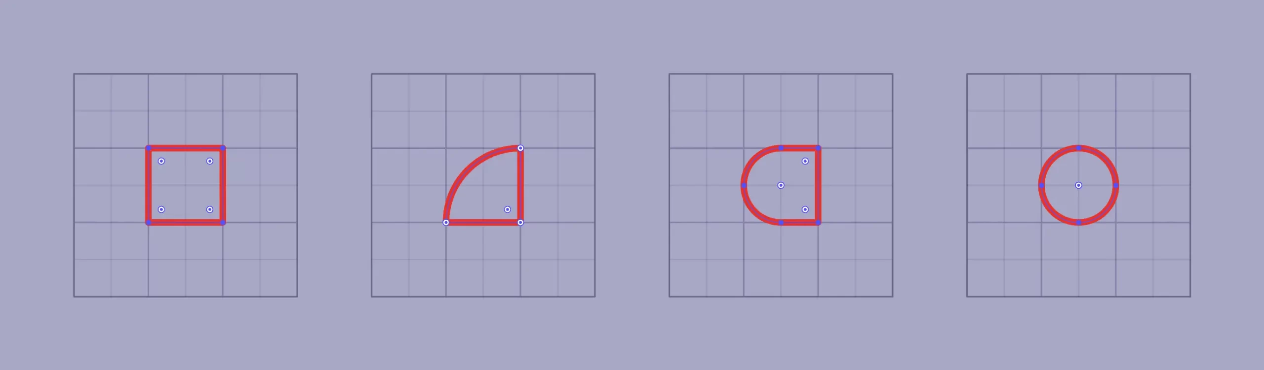
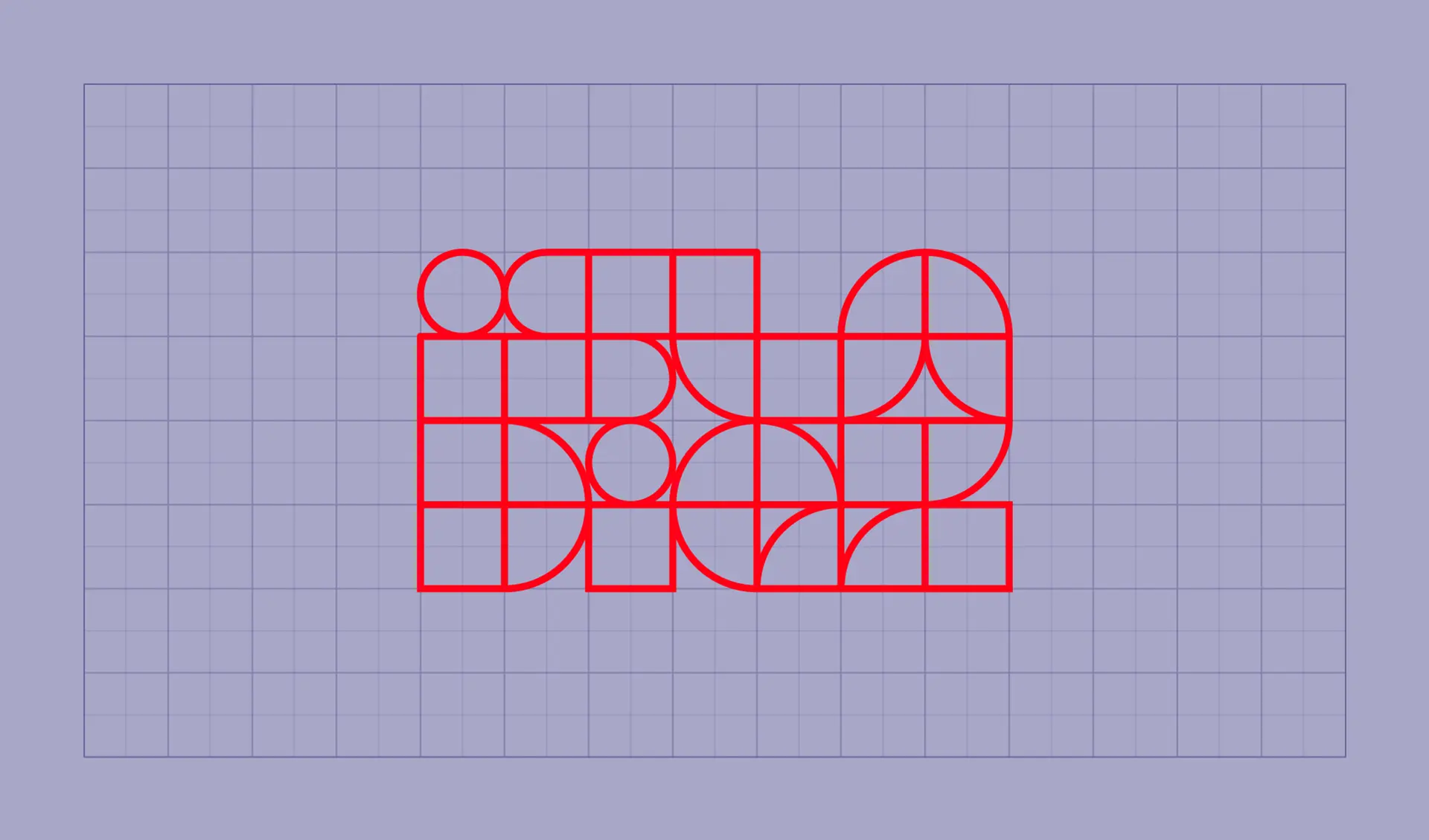
Build the identity on a modular grid and simple geometries to stay bold while remaining consistent across formats.
Key Decision 2
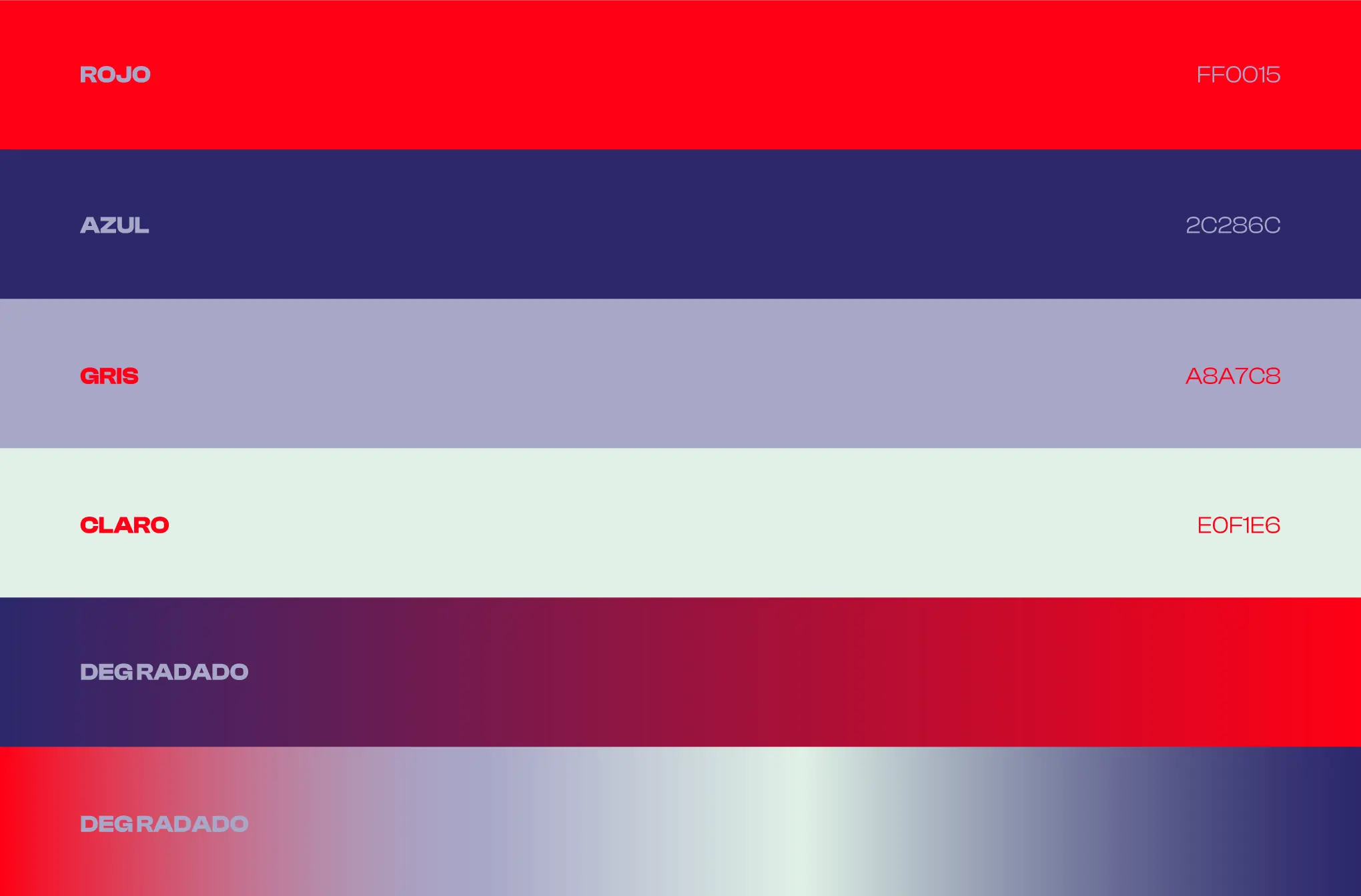
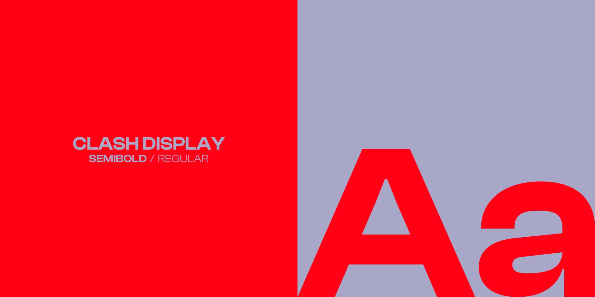
Use striking contrast (palette + gradients) and robust display typography to convey a younger, more dynamic personality.
Key Decision 3
Let the website prioritize visual impact and showcase work, adding “early internet” cues (marquees / 3D accents) as a deliberate brand device.
Solution
Solution 1
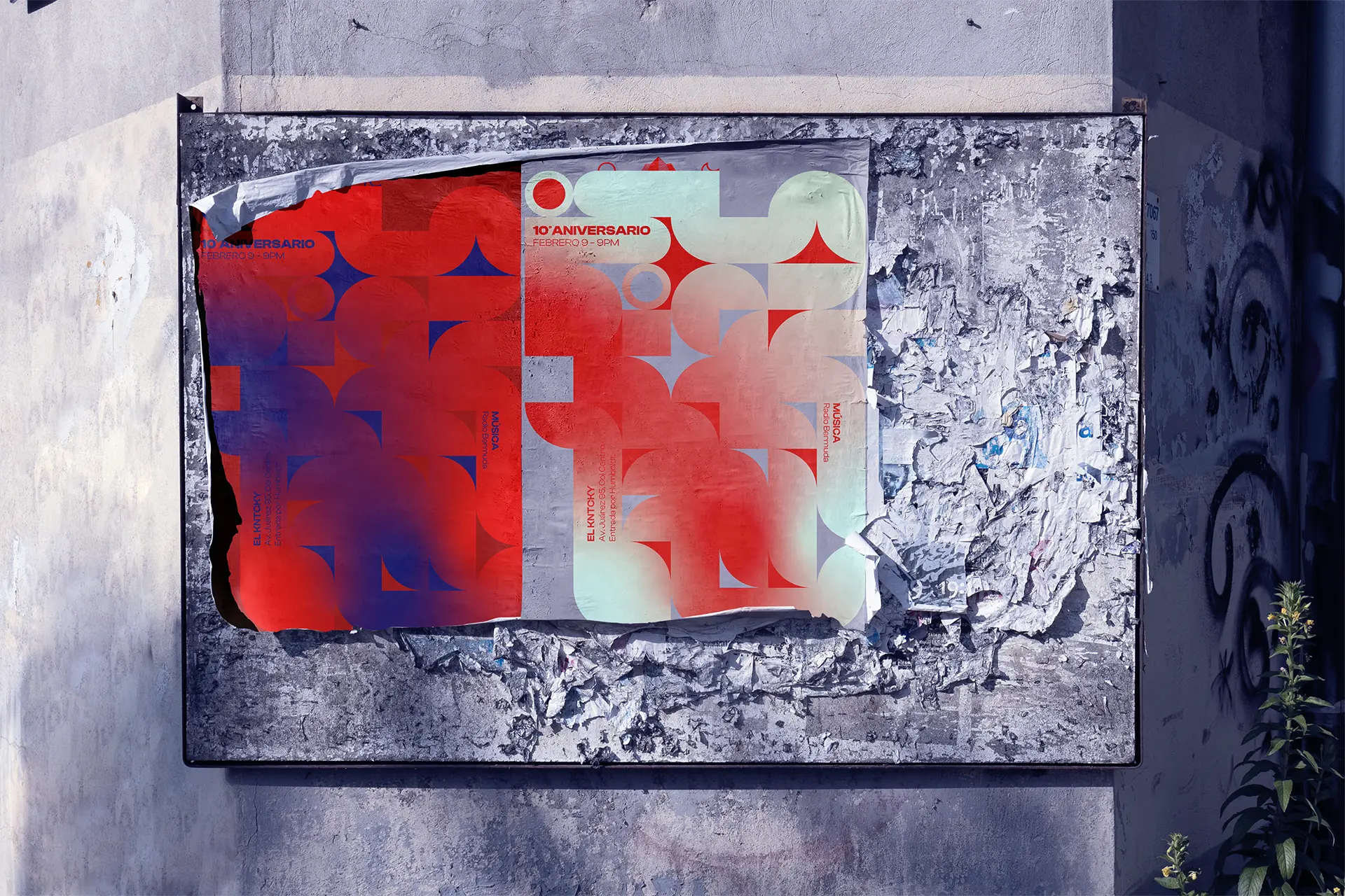
Grid-based visual identity system (shapes, spacing, typography, color and gradient rules).
Solution 2
Website redesign focused on showcasing productions with dynamic, high-impact layouts.
Solution 3
Social media guidelines that translate the identity into repeatable rules for ongoing posts and launches.
The grid and geometric primitives define a repeatable visual system that scales across brand applications.
Results
Results
Anniversary relaunch delivered as a cohesive identity + website package designed to present Isla as timeless, modern, and bold.
Results Method
Validated via stakeholder reviews and delivery sign-off; no post-launch performance tracking available.
The identity extends into communications through consistent typography, layout, and color behavior.
Systemization
Guidelines codified grid, typography, and color/gradient rules so future executions stay coherent.
Reusable layout conventions for web and social reduce inconsistency during ongoing content updates.
What I'd Do Next
Expand the guideline set with additional templates for new formats (stories, reels, event announcements).
Add lightweight post-launch tracking for engagement and inbound enquiries to guide iteration.
Expand the guideline set with additional templates for new formats (stories, reels, event announcements).
Add lightweight post-launch tracking for engagement and inbound enquiries to guide iteration.
Credits
Isla brand owners and leadership stakeholders (briefing, reviews, and launch alignment).
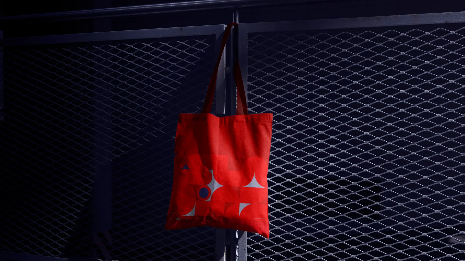
Shape primitives derived from the grid enable consistent composition across sizes and formats.High-contrast palette and gradients establish a bold, contemporary tone.The logo construction aligns with the grid system to keep the identity cohesive.Display typography choices reinforce a modern, dynamic personality.Poster applications show how the system scales into print for the anniversary launch.Anniversary tote application shows the identity system holding up in real-world merch.
Next case
Carbon Eye
CO₂ emissions dashboard concept for utilities, translating complex sources and indicators into configurable views for departments, reports, and governance.